THE STORY
WalletWize is a financial management application startup. UX methodologies, policies, and procedures were essentially non-existent when I came on board. In light of this, I saw an opportunity for me to advocate for comprehensive UX research and design strategies.
MY ROLE
My contributions at WalletWize spanned everything from walking the CEO and CTO through the entirety of the UX process to overall design consultation, contributions, and exhaustive UX methodology implementation.
Outside of those larger responsibilities, there were two sections of the app that I was specifically responsible for designing. Those were the Plans & Pricing section, and the Monthly Subscriptions section.
Analyze
WalletWize had already settled on a rough design concept. The features were mostly solid, though the visuals were lacking significantly. This was due to a combination of screens designed by interns fresh out of design school and a lack of knowledge regarding overall UX design processes.
Define
I needed to create a methodical approach to iterating for the user personas I created. I knew that if we did not implement defined processes and procedures, the final designs were in danger of being rejected by the Apple App store. Consequently, it was up to me to assemble design process documentation, and present it as a reference guide for all design stages and individual iterations.
Build
We were taking several steps back in the process with this new approach, which meant we would have to iterate on a completely re-imagined overall concept. The challenge here was to make sure that quality and consistency standards were being met, while continuing to advocate for this new approach to the CEO and CTO.
Test
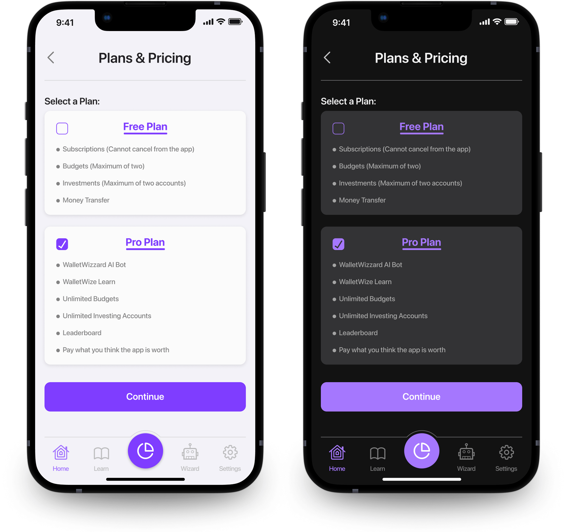
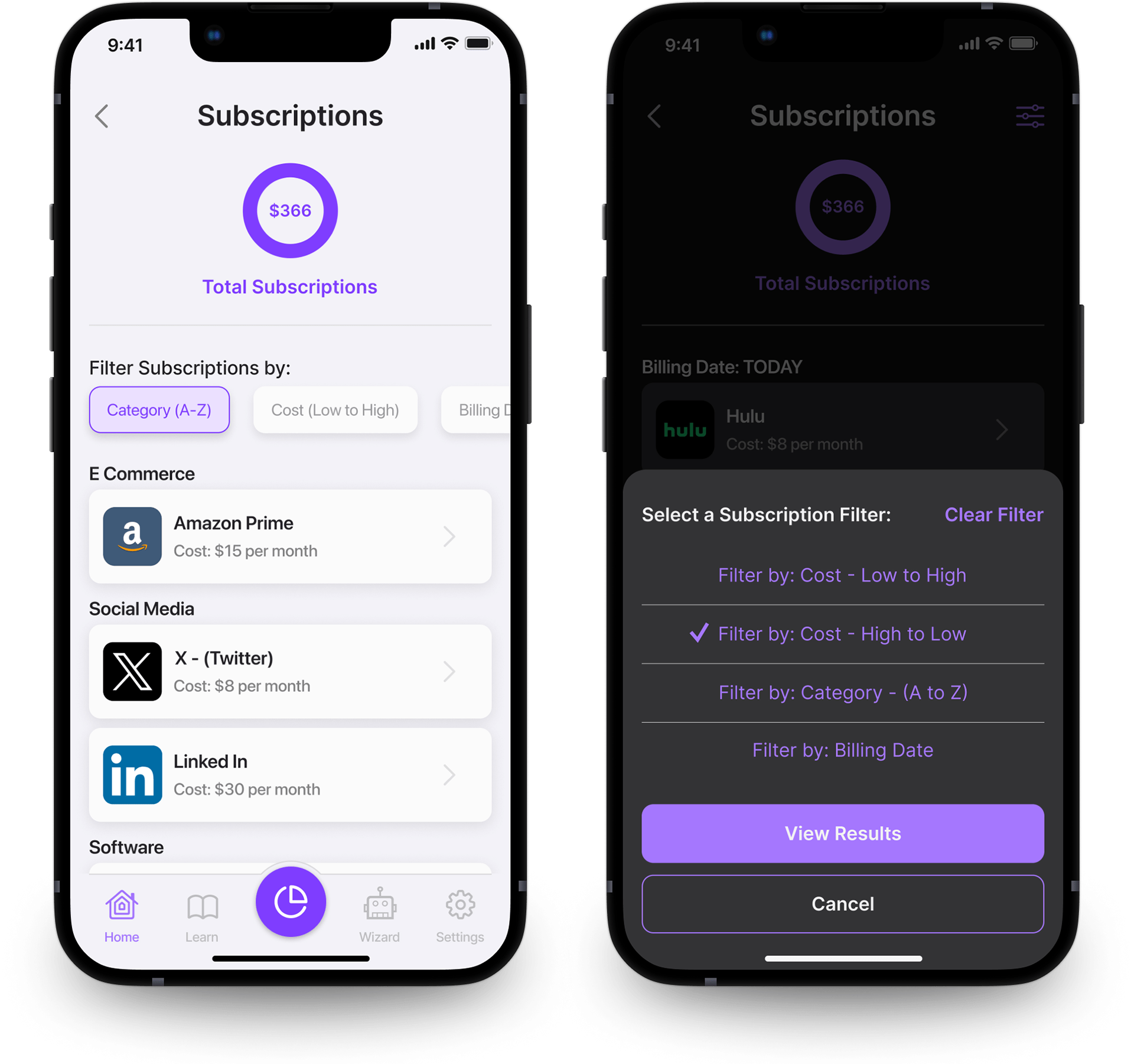
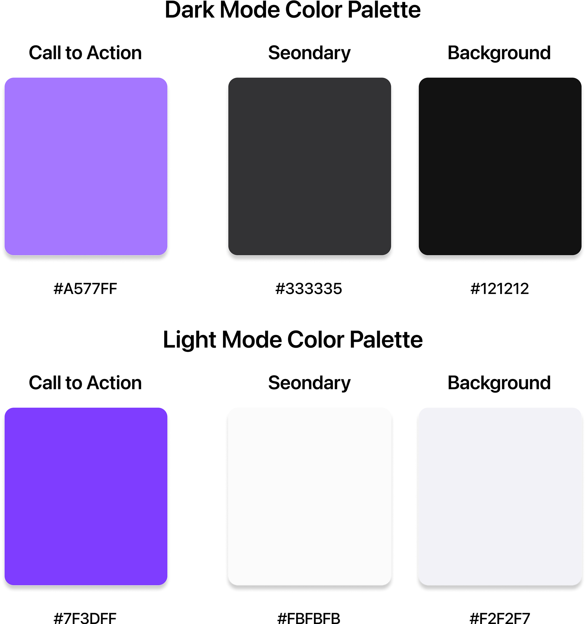
For my specific design assignments I assembled two interactive prototypes for some user testing. To do this, I utilized a Light Mode and a Dark Mode - with the same instructions for both sets of screens. The results provided much needed vision for what could be improved, and worked best from both a usability and visual standpoint.
USER PERSONAS

User Persona #1
Annie is a senior in high school with an inquisitive mindset. Never one for taking things at face value, Annie likes to understand things for herself and likes the feeling that she knows more than the average person her age. She takes pride in setting and meeting her financial goals, and she has a blueprint that she is always looking to tweak in the constant quest for bettering her financial picture.

User Persona #2
Sylvan is a second-year electrical engineering major at a very well-known Division One university. He is a self-starter and motivated to stay ahead financially. The oldest of five children, Sylvan is relentless in his saving and investing practices. As a constant consumer of information, Sylvan prioritizes tools that give him solid and consistent quantities of both to inform his daily choices and yearly goals.
LOW FIDELITY WIREFRAMES
THE PROBLEMs
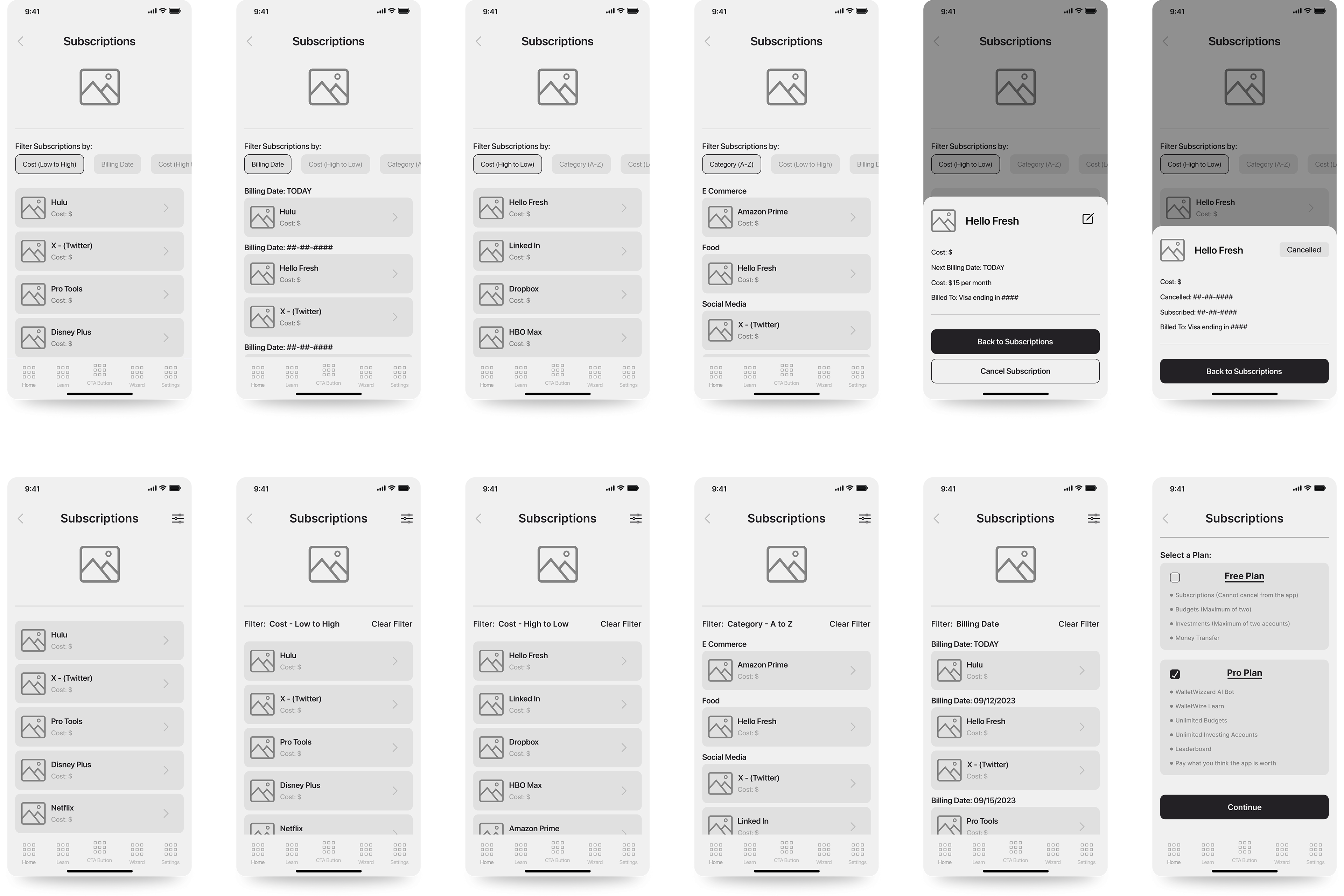
Both the Plans & Pricing flow, and the Subscriptions flow were fairly simple to put together. The main issues were screen real estate for Plan's & Pricing, and deciding on which filter approach to employ when displaying the list view of all the Subscriptions.
SOLUTION #1
For the Plans & Pricing flow I chose a simple pattern that lists each plan, and its corresponding features.
The trick here was to ensure that the readability of each feature was not negatively effected by utilizing a list pattern, and that the common "stacked" visual approach would allow users to easily note the differences between each plan.
SOLUTION #2
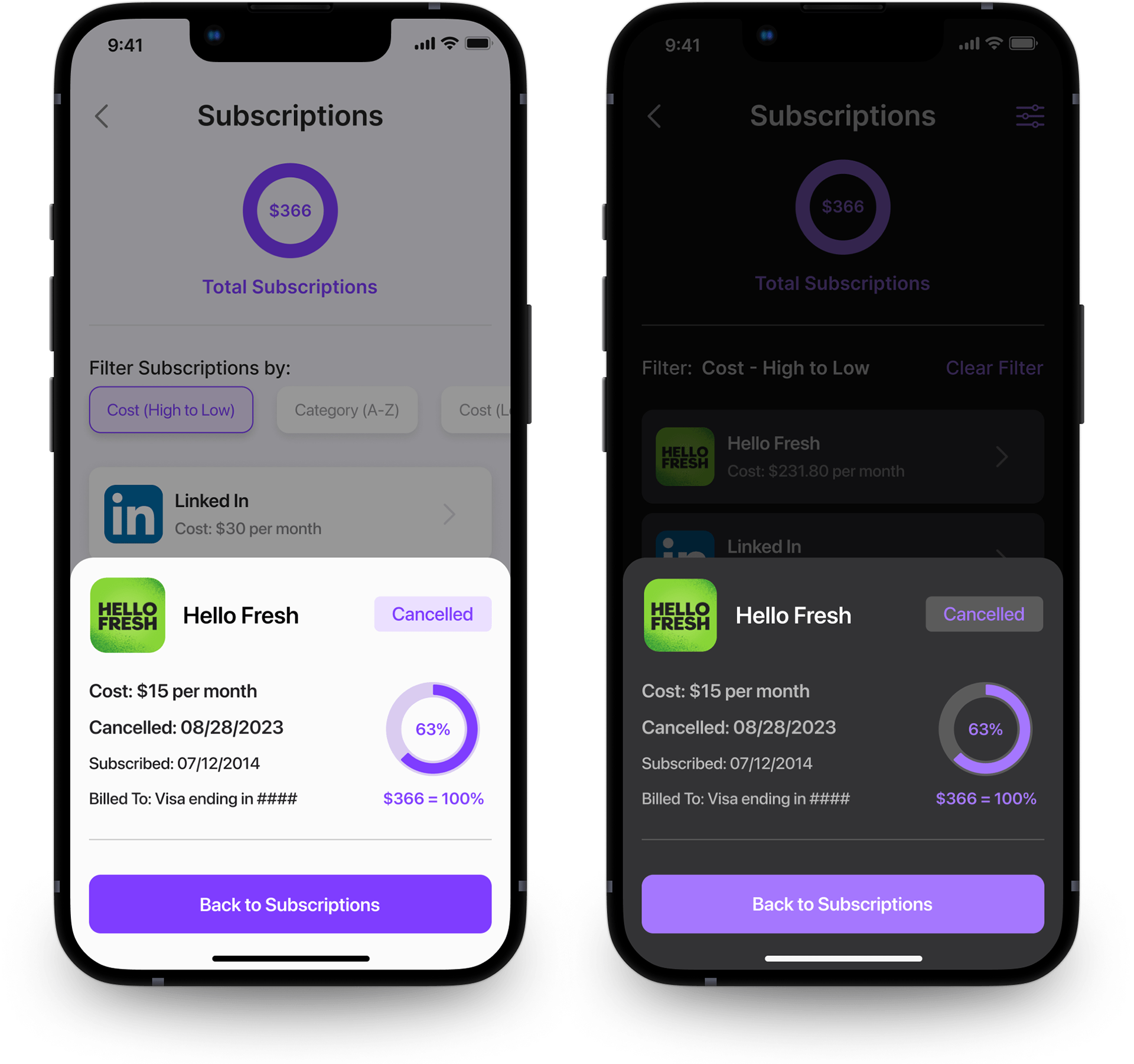
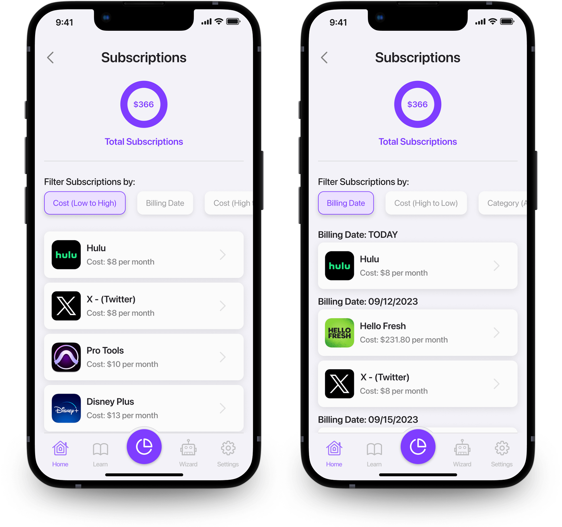
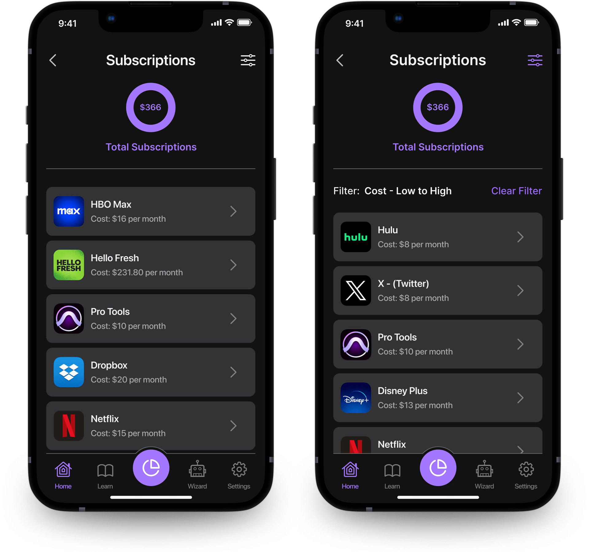
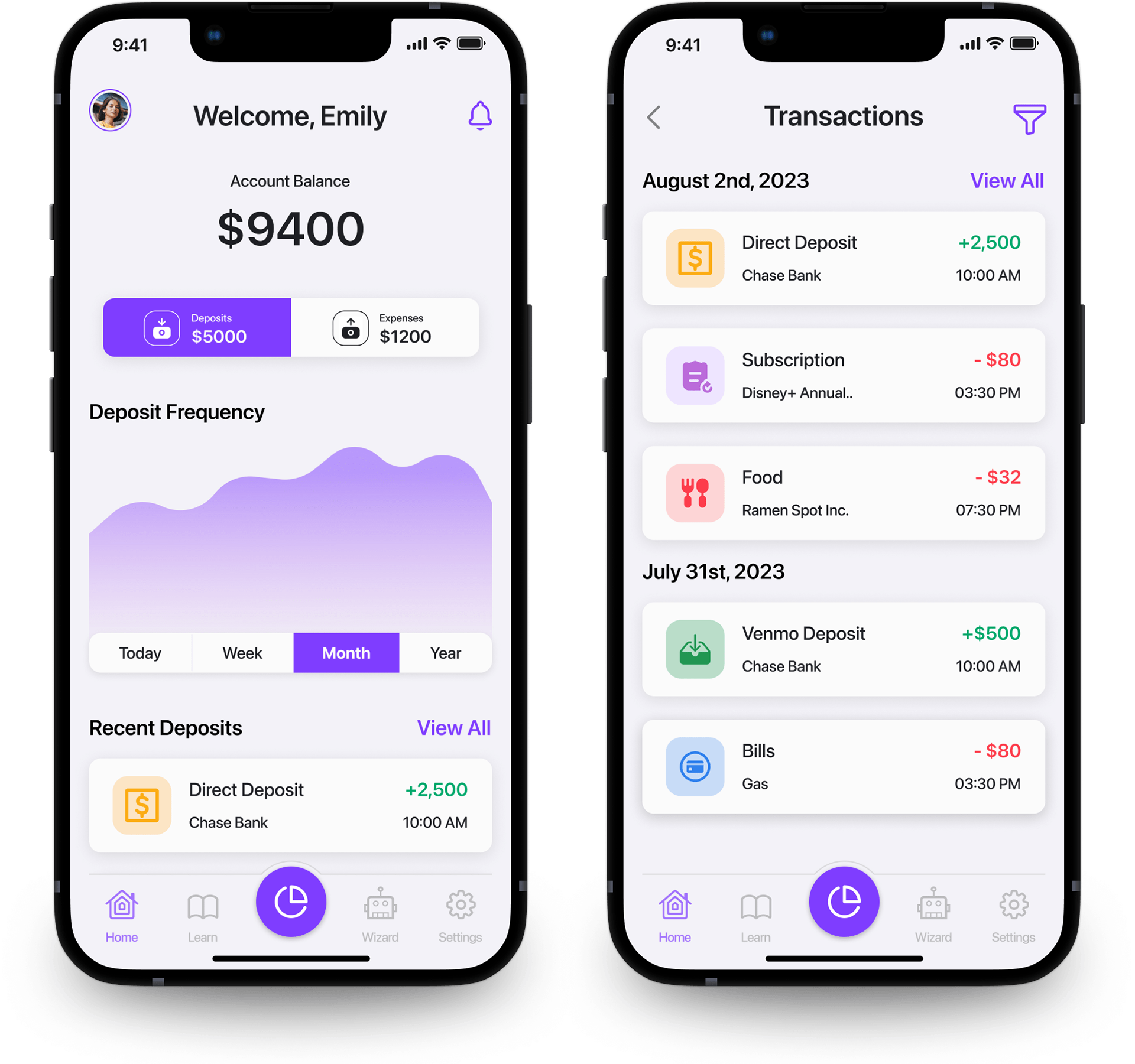
For the Subscriptions flow I chose two Filter patterns to display each subscription. One utilized a horizontal list of filters that were never hidden, and the other used a very familiar icon that triggered an overlay which displayed all filters in list form. Users would select their filter, and press "View Results" to see the newly tailored list.
TESTING INSIGHTS
The data results from the user testing prototypes supported a preference of the horizontal pill list for the display filters. The dark mode was the most popular visual environment, and the common Apple drawer overlay for subscription profiles was well received.
Screen Consultations
There were several different screens I consulted on that were not part of my assigned user flows. Due to the nature of 5 design interns being responsible for all the other sections of the site, I would have to delegate my time carefully to ensure that the overall design concept was consistent, in compliance with Apple's Human Interface Guidelines, that it was accessible, and that it served brand identity collateral.
LEADERSHIP LESSONS
I wanted the design interns to learn, but I also wanted to deliver an effective solution. A delicate balance must be struck in order to mentor individuals, yet expect them to adhere to concepts they haven't fully learned quite yet. My respect for good Senior Designers and Directors has grown exponentially because of this experience.
design changes
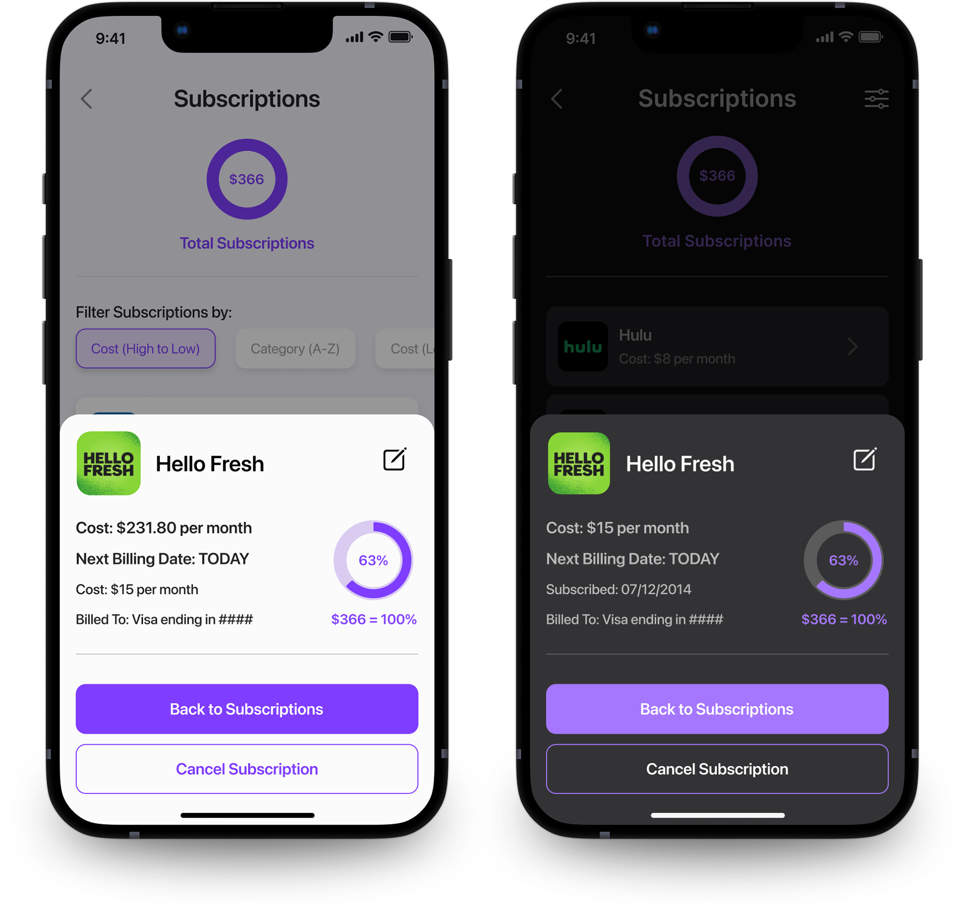
In light of the user testing data, I amended two aspects of the final screens. The first change I made was to utilize different font sizes to implement some visual hierarchy within the data points of the profile view for each subscription. The second change was to the order of those data points in order to emphasize the most relevant information to the user.
CONCLUSIONS
What I learned at WalletWize was invaluable for me as a designer and an aspiring creative director. When a design team is given individual tasks in service to a greater goal, clear communication regarding design expectations is vital.