THE TIMELINE
January 2023 - March 2023
THE REQUIREMENTS
Elevance Health’s Secure Messaging was initially comprised of two different online solutions that are both woefully outdated. A modernized visual redesign was requested of the design team to assist in the process of combining the two platforms into one application.
THE TEAM
1 Design Lead, 1 UX/UI Designer
MY RESPONSIBILITIES
My responsibilities for this project consisted of three main tasks. The first was to clearly define all design issues. Second, I devised a design modernization strategy to meet project requirements. Third, I collaborated with the design lead assigned to the project to obtain approval for each design iteration.
THE PROBLEM
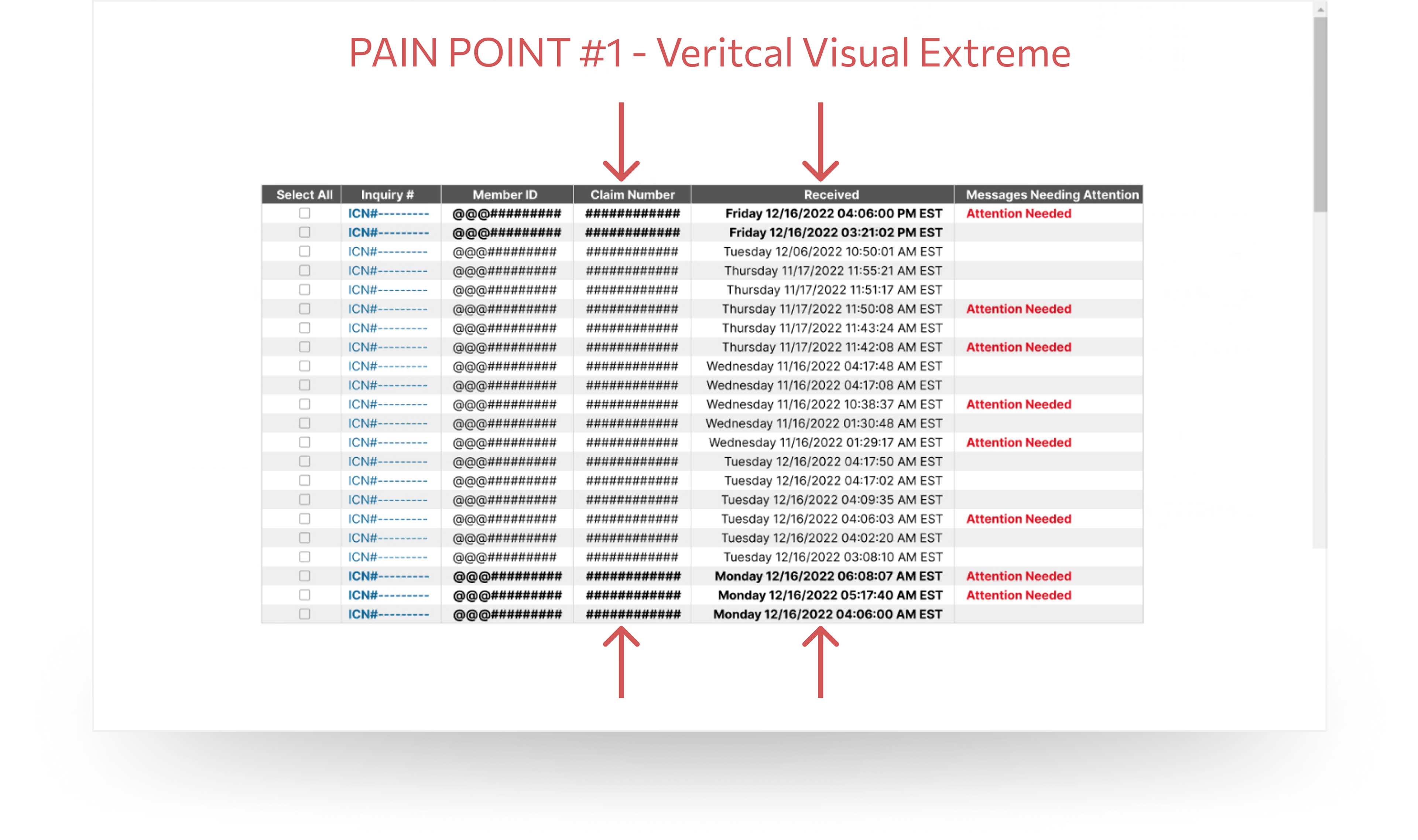
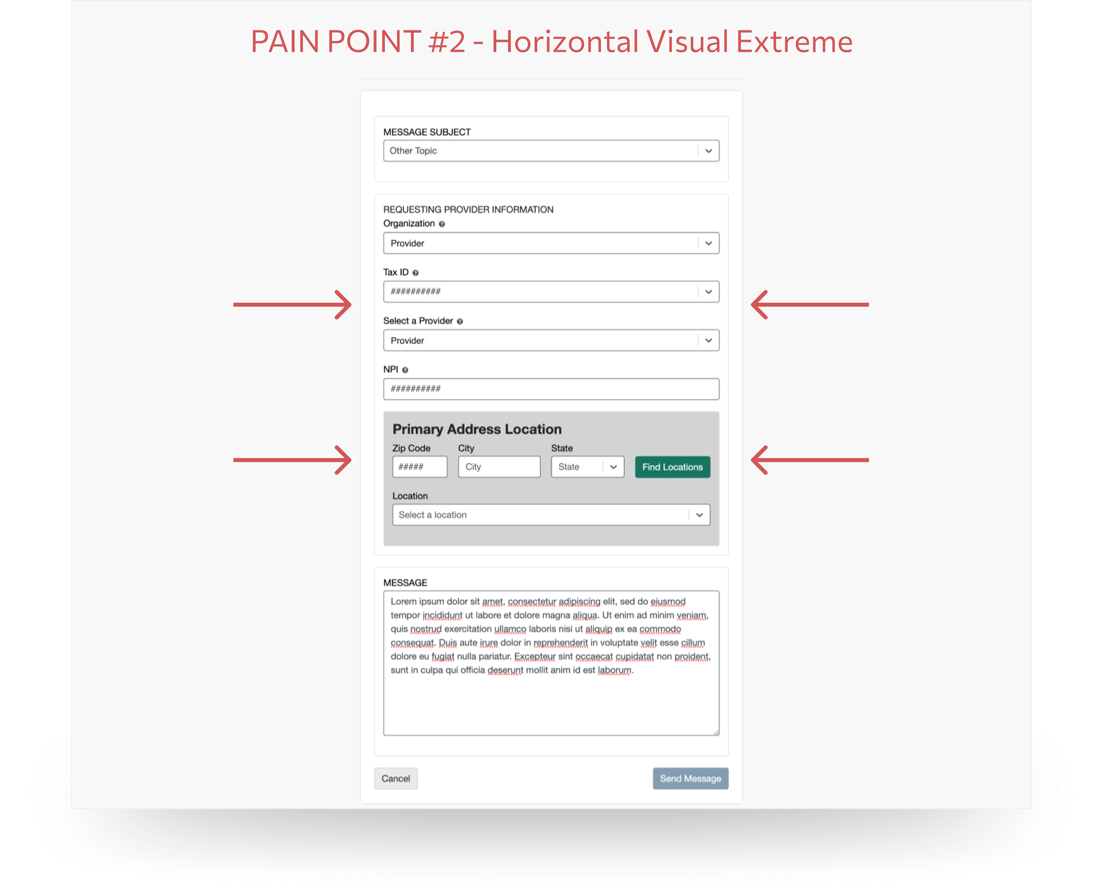
Both of the current applications Elevance was using were legacy platforms that were going to need significant adjustments in order to combine them in a visually pleasing way. A lack of readability and proper usage of negative space had created two very bad visual extremes that would ultimately serve as guard rails in my process going forward.
THE SOLUTION
In the process of ideating for a modernization strategy, I was instructed to leverage an existing application to provide the requisite solution. Following those specific guidelines, I proposed a slightly updated version that made use of a more spacial visual motif along with new typography and iconography to round out the final designs.
VISUAL PAIN POINTS
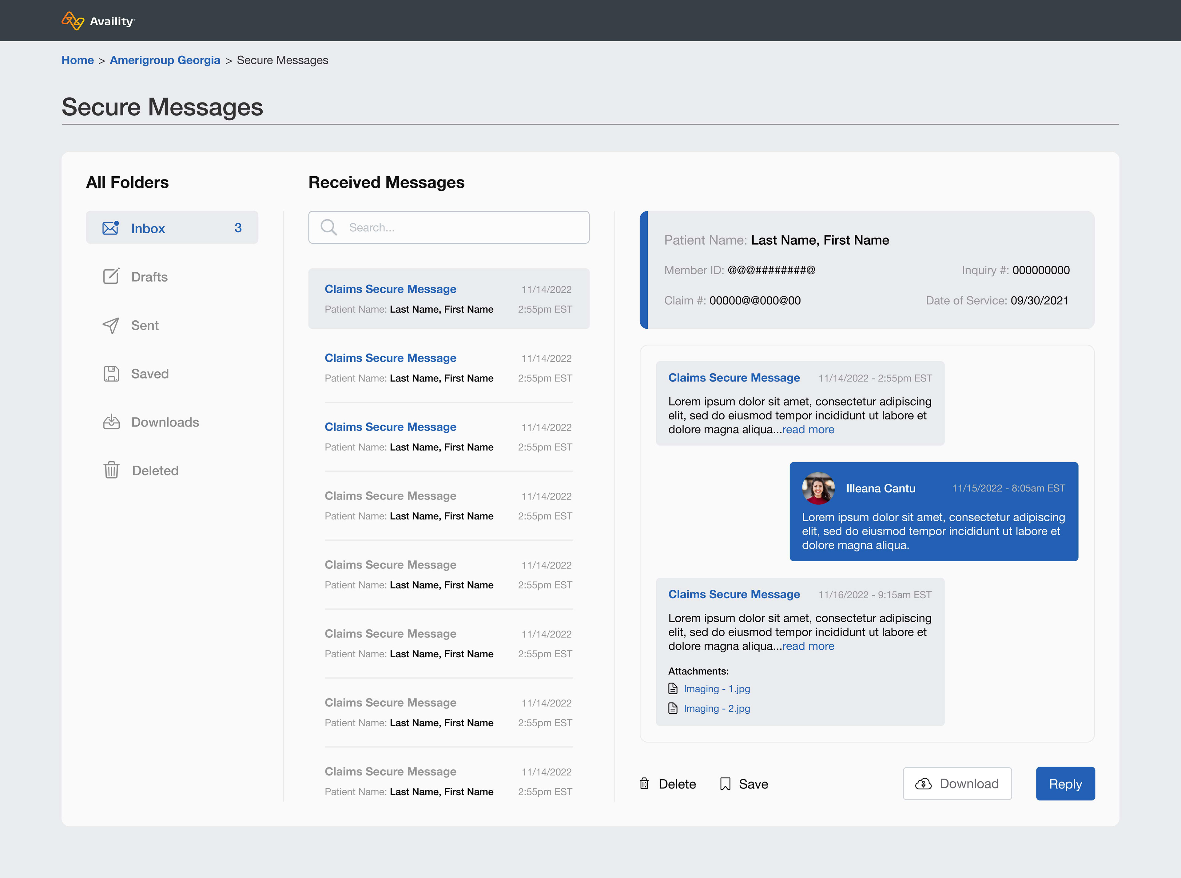
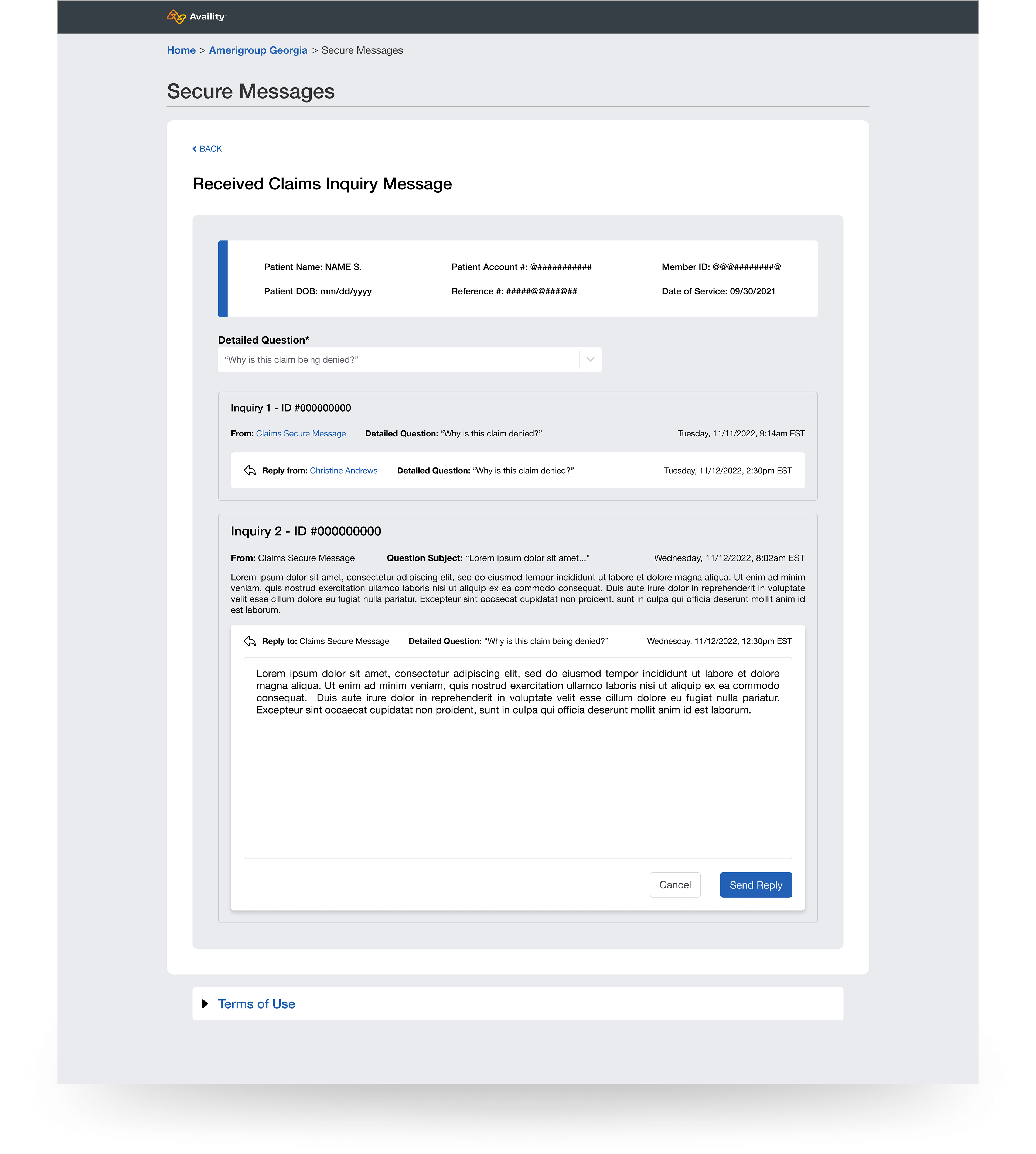
UPDATEs - MESSAGE VIEW
* The utilization of the entire interface allows for negative space to support readability improvements and contributes to a more modern visual theme.
* The Message History feature provides the ability for multiple users from the same practice to see which messages have already been sent a response.
* Data points relevant to the message subject matter are stacked in a symmetrical pattern, and supported by an Availity design system Alert - Card.
* The Detailed Question dropdown menu provides appropriate context regarding the details of the message or entire message thread.
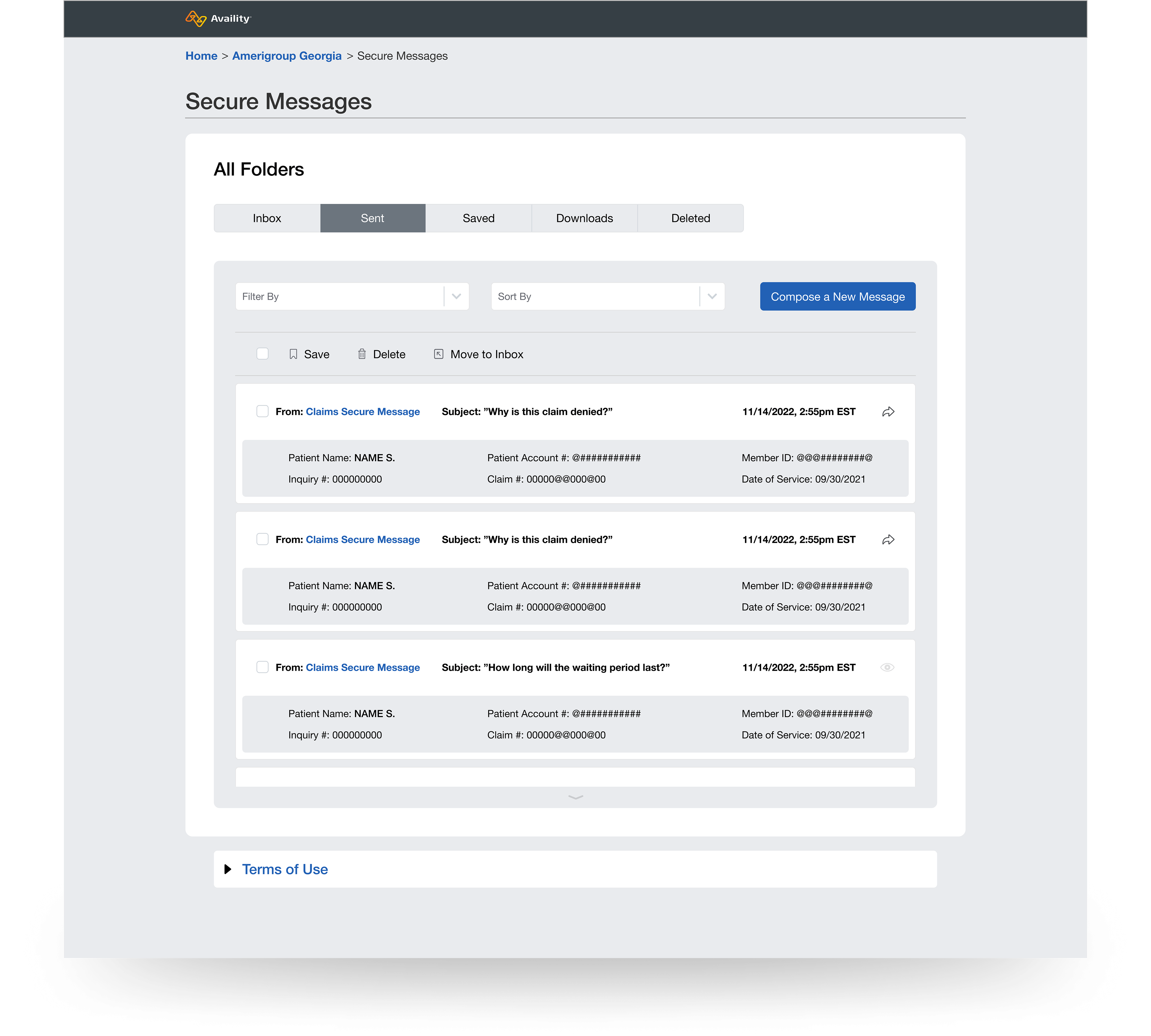
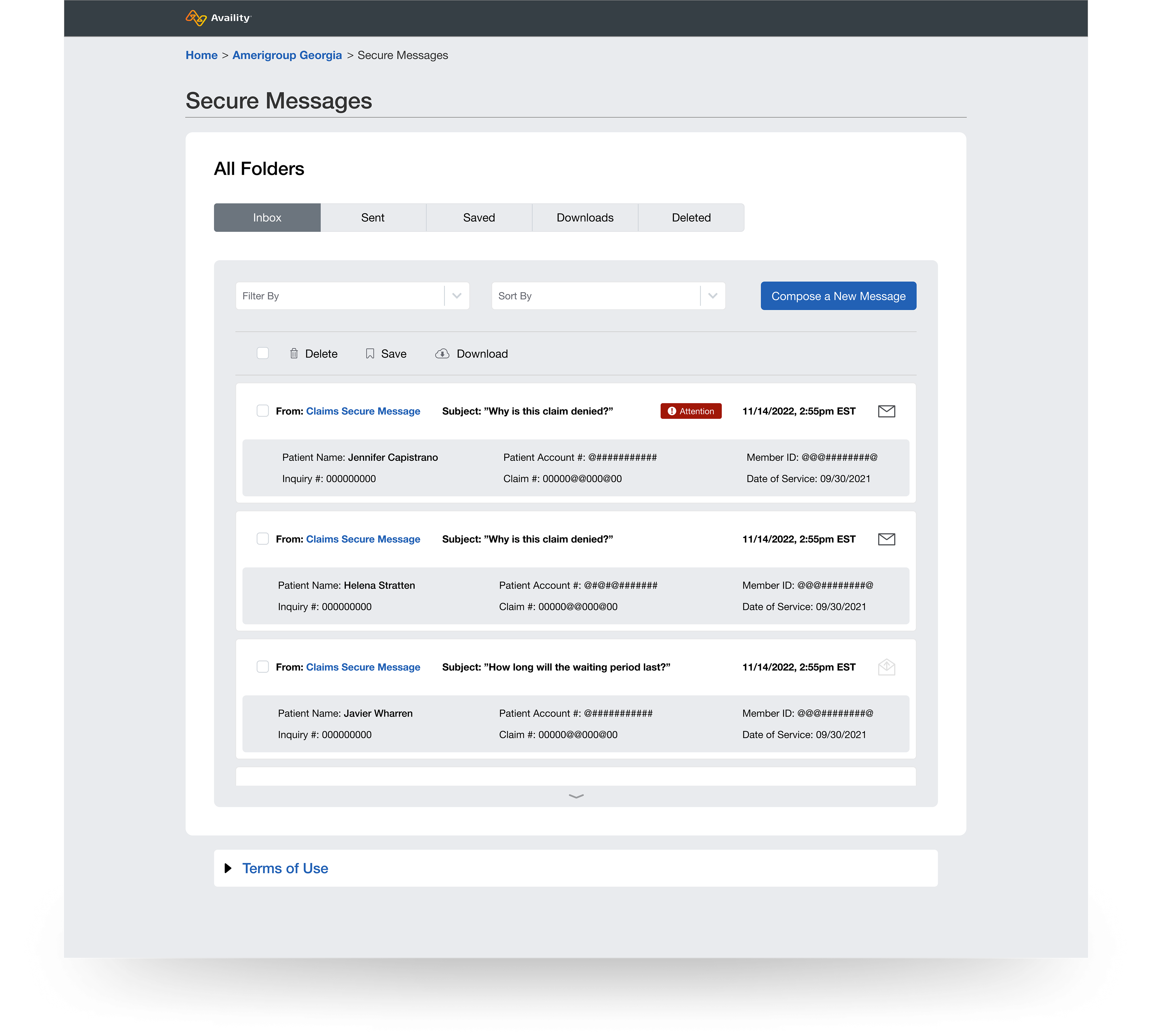
UPDATEs - folders VIEW
* The expanded view of each list item allows users to see additional data points for each message, as well as date and time stamp information.
* The usage of icons gives users context for which messages have yet to be opened, and alert badges note messages that are urgent in nature.
THE RESULTS
Overall, the end result was a better visual interface in terms of space, and enhanced features. That said, the final design was a slightly modified version of a legacy application that I was never involved with. Those that were making final design decisions asked for the slight changes in the form and visual patterns seen above. Ultimately, my vision was for something quite different from the final product, as seen below.
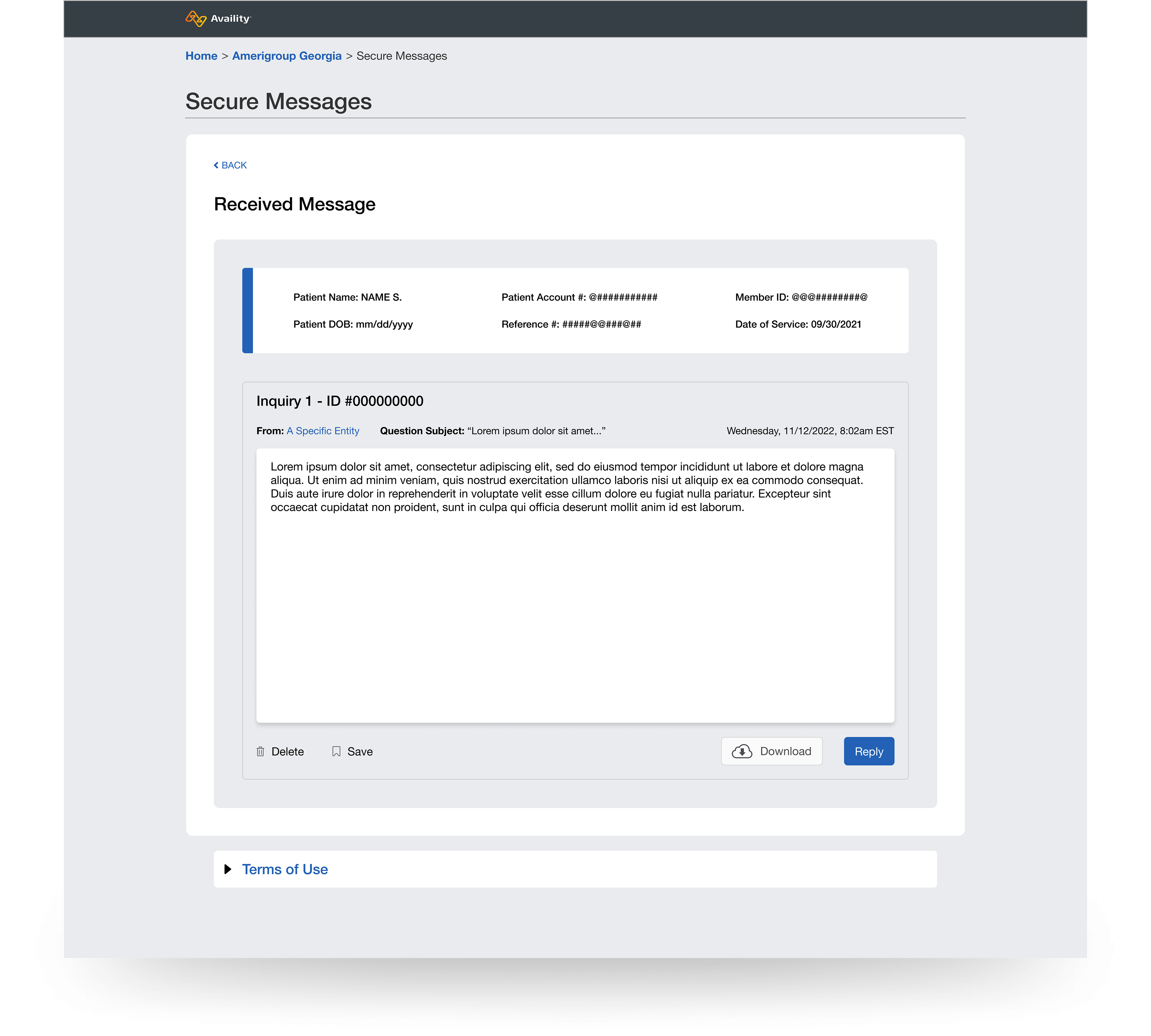
WHAT I WOULD DO DIFFERENTLY
The screen you see below would allow users to view a message, reply to that message, and see previous messages and responses from their organization - all from the same user viewpoint. From my perspective, this a far more usable and modernized solution than the one that was ultimately built and now in use. However, sometimes the job of a designer is to make the best with what they are instructed to do.